In today’s data-driven world, the ability to create insightful reports and dashboards is crucial for making informed business decisions. Looker Studio (previously Google Data Studio), a powerful data visualisation tool from Google Cloud, empowers users to transform raw data into meaningful insights.
This step-by-step tutorial by Creative Networks is designed for beginners who want to master Looker Studio from the ground up, enabling them to create professional, data-driven reports and dashboards.
What is Looker Studio?
Looker Studio is a part of Google Cloud’s suite of data analytics tools. It provides a user-friendly platform for data exploration, visualisation, and reporting. Looker Studio allows users to connect to various data sources, including Google Analytics, Google Sheets, BigQuery, and more, to create dynamic and interactive dashboards. This makes it easier for businesses to visualize their data, track performance metrics, and make data-driven decisions.
What Does Looker Studio Help With?
- Data Connectivity: Looker Studio connects with a wide range of data sources, allowing users to bring all their data into one place.
- Data Visualisation: It offers numerous visualisation options such as charts, graphs, tables, and maps to help users present data in a meaningful way.
- Interactive Dashboards: Users can create interactive dashboards that provide real-time data insights.
- Collaboration: Looker Studio makes it easy to share reports and dashboards with team members and stakeholders, facilitating collaboration.
- Customisation: Users can customise their reports and dashboards to align with their branding and specific business needs.
1- Setting Up Your Looker Studio Account
Before diving into creating reports, you need to set up your Looker Studio account.
Here’s a quick guide to get you started:
- Open your web browser and go to the Looker Studio website.
- Click “Sign In” at the top right.
- Enter your Google account details and follow the prompts.

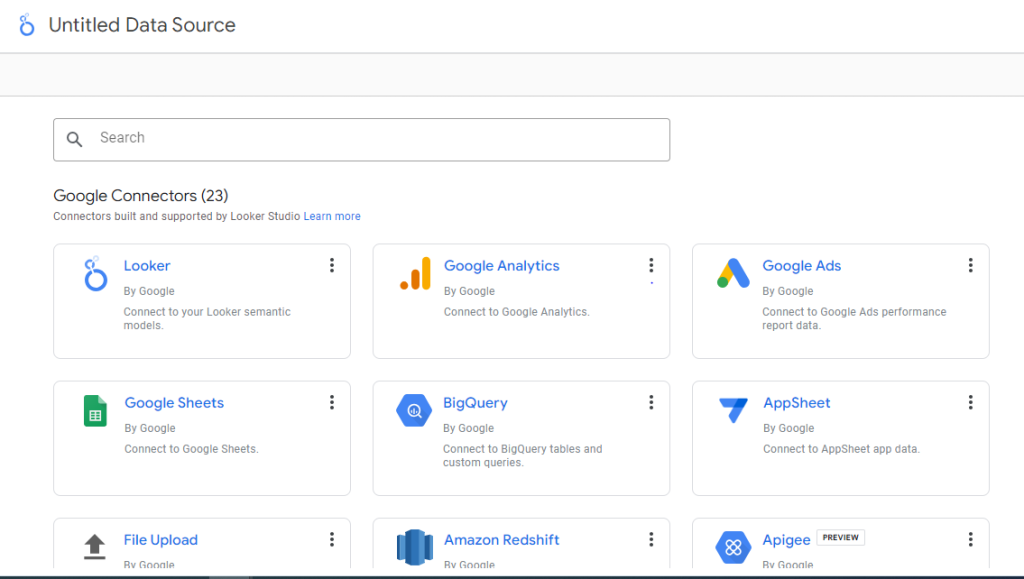
2- Connecting Your Data Sources
Looker Studio can connect to various data sources like Google Analytics, Google Sheets, BigQuery, and more. Connecting these sources allows you to visualize and analyze data from multiple platforms in one unified dashboard.
- From the Looker Studio dashboard, click the “Create” button at the top left.
- Select “Data Source”. From the dropdown.
- Browse the list of available data sources like Google Analytics, Google Sheets, or BigQuery. Use the search bar if needed.
- Click on the data source you want to connect.
- Follow the prompts to authenticate your account and grant Looker Studio access to your data. For example, sign in with your Google account for Google Analytics and allow access.
- Review the data you’re connecting, then click “Add” or “Connect” to finalise.
3- Creating Your First Report
Now that your data sources are connected, it’s time to create your first report. Follow these steps to get started:
- Click on the “Create” Button and Select “Report”
- A new window will open where you can add a data source. Click on “Add Data” to select from your connected sources.
- Choose the data source you want to use and click “Add.”
- You will now see a blank report canvas. Use the drag-and-drop interface to add charts, tables, and other visual elements.
- Customise each element by selecting dimensions and metrics that best represent your data.
4- Designing Your Dashboard
A well-designed dashboard makes data easier to understand and more actionable. Here’s how to design an effective dashboard in Looker Studio:
- Identify the most important metrics that will help you achieve your goals. These could be sales figures, website traffic, user engagement statistics, or any other relevant data points.
- Consider the audience for your dashboard and what information they need to see.
- Use the Grid Layout to ensure your dashboard is easy to read and navigate.
- Arrange related metrics together and place the most important visualisations at the top for immediate visibility.
- Make use of different types of charts and tables to best represent your data.
5- Add Text Boxes, Images, and Shapes to Enhance Visual Appeal
- Use text boxes to provide context, titles, and labels for your visualisations. Clear headings make it easier for viewers to understand what each section represents.
- Incorporate images like company logos or icons to brand your dashboard and make it visually engaging.
- Use shapes and lines to separate sections and highlight important data points, improving the overall readability.
6- Adding Visualisations
Looker Studio offers various visualisation options such as charts, tables, maps, and more.
- Click on the “Add a chart” button.
- Choose the type of chart you want to add.
- Configure the chart by selecting dimensions and metrics.

7- Customising Your Reports and Dashboards
Customisation allows you to tailor your reports and dashboards to your audience’s needs, ensuring they are visually appealing and functional.
Here’s how to customise your Looker Studio reports and dashboards:
- Use the “Style” Tab to Change the Appearance of Your Visualisations
- Adjust elements like borders, background colors, and gridlines to enhance visual appeal.
- Choose colors that align with your brand’s palette for a professional look.
- Select readable fonts and text sizes, maintaining consistency with your brand’s typography.
- Apply these styles across all elements for uniformity.
- Click “Add a Control” from the toolbar and choose “Filter” to allow users to filter data based on criteria like region or product category.
- Add a date range control to enable users to view data for different time periods, useful for trend analysis.
8- Sharing and Collaborating
Collaboration is essential for making data-driven decisions as a team.
- Click on the “Share” button.
- Enter the email addresses of your collaborators.
- Set the appropriate permission levels (view, edit, etc.).
Tips and Best Practices
Creating effective reports and dashboards requires a thoughtful approach. Here are some best practices to ensure your visualisations are both impactful and easy to understand:
- Keep it Simple
Focus on displaying the most important metrics and data points. Too much information can overwhelm the viewer and obscure key insights.
Use white space effectively to separate different sections and visualisations, making the dashboard easier to read.
- Use Consistent Design
Choose a color scheme and set of fonts that align with your brand and use them consistently throughout your reports and dashboards. This helps in creating a professional look and feel.
Maintain a uniform layout for similar types of reports and dashboards to make navigation intuitive and predictable for the users.
- Tell a Story
Arrange your visualisations in a logical order that guides the viewer through the data. Start with high-level summaries and drill down into more detailed information.
Use text boxes and annotations to provide context and explain the significance of the data, helping viewers understand the narrative behind the numbers.
- Regular Updates
Ensure your data sources are set to update regularly so that your reports and dashboards always reflect the most current information.
Periodically review your dashboards to ensure they remain relevant and make necessary adjustments based on feedback and changing business needs.
By following these best practices, you can create reports and dashboards that are not only visually appealing but also highly functional, providing valuable insights that drive better decision-making.
Contact Creative Networks Today
Mastering Looker Studio opens up a world of possibilities for data visualisation and reporting. By following this comprehensive guide, you’ll be well on your way to creating insightful and impactful reports and dashboards that drive business success.
Ready to Take Your Data Visualisation to the Next Level?
Join Creative Networks today and harness the full potential of Looker Studio with our expert guidance and support. Whether you’re just getting started or looking to refine your skills, we offer the resources and community you need to excel.
Contact us now to start your journey towards data-driven success with Creative Networks!
Get Started Now!